Global Temperatures In 2016

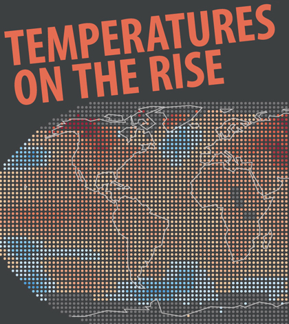
Global temperatures infographic. (Credit: Nate Christopher / Fondriest Environmental)
It’s not hard to find information about rising global temperatures in 2016. And it seems like the list of broken records just keeps getting longer.
Here’s a sampling of some of our recent coverage that deals with surging temperatures:
- The warming Great Lakes;
- heated spring waters in the Colorado River;
- and Chesapeake Bay surface temperatures going up faster than air temps.
Info on global temperatures in 2016, though not hard to find if you know where to look, can be a little difficult to take in. With that in mind, we included in our summer 2016 edition of the Environmental Monitor an infographic on changing temperatures this year.
Instead of a simple chart or two, the infographic gives some perspective to the shifts that are taking place with global temperatures in 2016. This includes a depiction of average temperature changes since 1880 as well as a clear showing of all the temperature records broken within the last 135 years.
If you would like a full-size version of the infographic for personal use, one is available for download on the Fondriest Environmental Flickr page. Check out our “climate change” tag for other stories on rising temperatures and the effects they may bring.

Global temperatures infographic. (Credit: Nate Christopher / Fondriest Environmental)


0 comments